Step 2 - Change the appearance of the selected item
In this step you use a List Box Item Container node with a state manager to set the appearance of the currently selected list item.
Create a List Box Item Container
In this section you create a List Box Item Container node which you use to set how the list items look when the user selects them. In the next section you create a state manager for the List Box Item Container node.
To create a List Box Item Container:
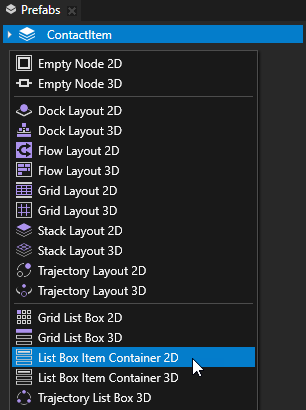
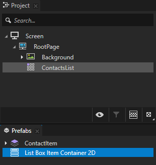
In the Prefabspress Alt and right-click and create a List Box Item Container 2D prefab. You use the List Box Item Container 2D to change the appearance of the item currently selected in the list box. List Box Item Container must always be a prefab.
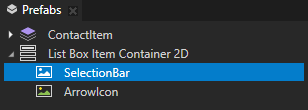
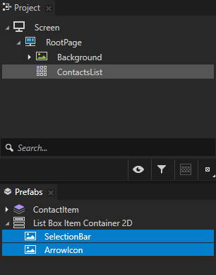
Inside the List Box Item Container 2D prefab you created in the previous step, create two Image nodes and name them SelectionBar and ArrowIcon. You use the SelectionBar and ArrowIcon nodes to show which list item is selected.
Set the appearance of items
In this section you use a state manager to set the appearance of the List Box Item Container node you created in the previous section. The state manager sets how the list items look when they are selected and not selected.
To set the appearance of items:
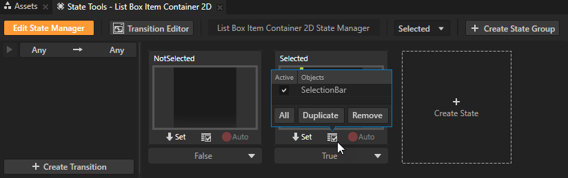
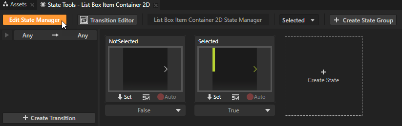
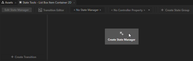
In the Prefabs select the List Box Item Container 2D node and in the State Tools click Create State Manager.
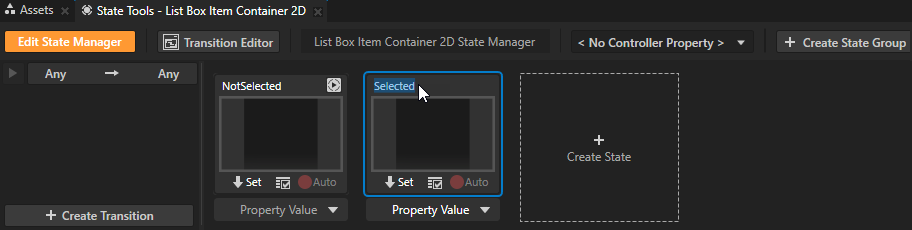
In the State Tools click Create State twice to create two states, double-click the name of each state, and rename the states. For example, name one state NotSelected and the other Selected. The Selected state defines the state of your application when the user selects an item in the list box, the NotSelected state when that item is not selected.
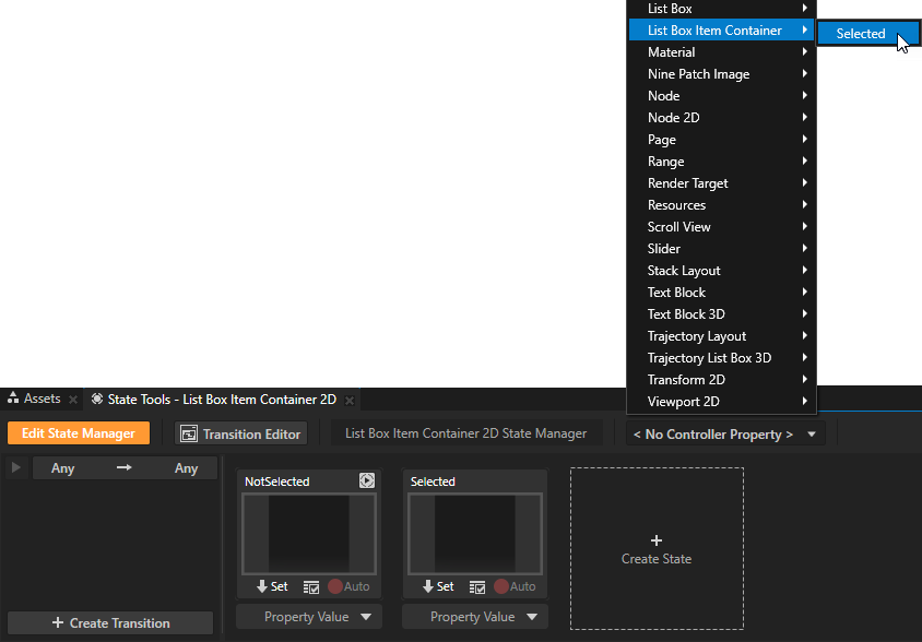
In the State Tools click the <No Controller Property> dropdown menu and select the List Box Item Container > Selected property. In a state manager the value of the property you select as the Controller Property defines the conditions when each state in a state group is active.
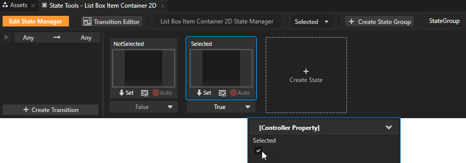
In the State Tools set the value of the controller property for each state:
For the NotSelected state leave the value set to False
For the Selected state set the value to True.
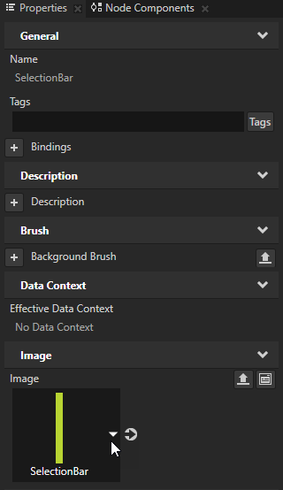
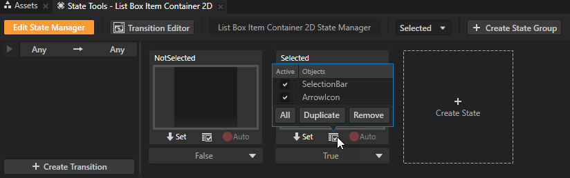
In the Prefabs select the SelectionBar node, in the Properties add and set the Image property to the SelectionBar image, and in the State Tools click below the Selected state to save the current image to that state. You set the state manager to display a selection bar when the user selects an item in the Grid List Box.
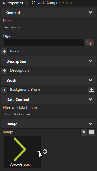
In the Prefabs select the ArrowIcon node, in the Properties add and set the Image property to the ArrowGreen image, and in the State Tools click below the Selected state to save the property value to that state.
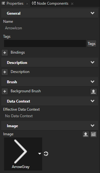
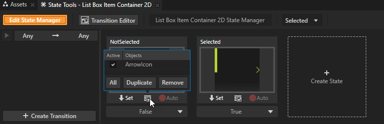
In the State Tools select the NotSelected state and repeat the previous step for that state but set the Image property for the ArrowIcon node to ArrowGray.
In the State Tools click Edit State Manager to deactivate the State Tools.
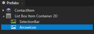
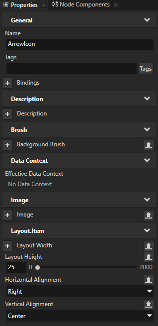
In the Prefabs select the ArrowIcon node and in the Properties set:
Layout Height to 25
Horizontal Alignment to Right
Vertical Alignment to Center
You position the arrow icon for each contact item to the right of that item.
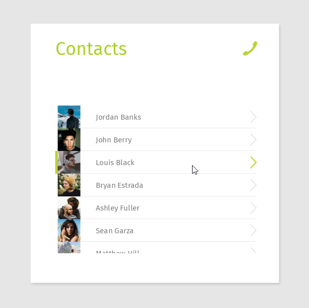
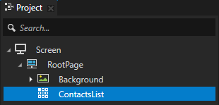
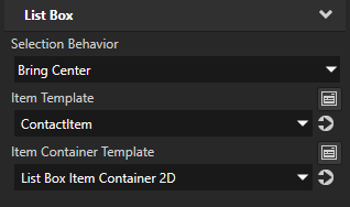
In the Project select the ContactsList node and in the Properties add and set the Item Container Template property to List Box Item Container 2D. The Item Container Template property allows you to share functionality between the items in a list box. When you set the Item Container Template property, each item in the list box inherits the functionality from the List Box Item Container node. For example, the Item Container Template can contain a state manager which changes the appearance of the selected item in the list box. This way you apply the same functionality for each item. In the Preview when you select a list item, the green selection bar moves to that item.
In this tutorial you learned how to use a Grid List Box node to create a scrollable list of contacts which receives data from a data source. You also learned how to adjust a Grid List Box to present the content in the application and how to set the appearance of the list items when the user selects an item in the list. Now you can:
 below the Selected state to save the current image to that state.